
 English
 Русский
 Español
Previously, we introduced the Period Comparison feature, allowing you to compare data across different time ranges. This functionality was initially available only in table format.
To make comparisons more visual, we have now extended this feature to charts.
How it works
Click the chart button to activate the comparison mode.
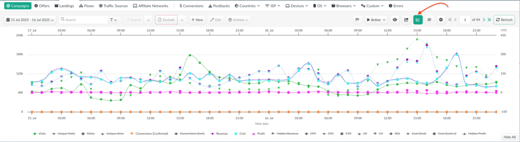
- The bottom axis displays the time scale for the start of the comparison period (e.g., July 15–16, with hourly breakdowns).
- The top axis displays the time scale for the end of the comparison period (e.g., July 17–18, with hourly breakdowns).
- The left axis shows numeric values representing event counts (visits, clicks, conversions, etc.). This scale may also represent percentage-based metrics such as ROI or CTR.
- The right axis reflects monetary values in the account’s currency, used for financial metrics.
Each metric is represented by two lines:
- Solid line – start of the comparison period.
- Dashed line – end of the comparison period.
Additional Options
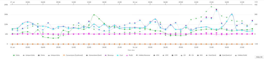
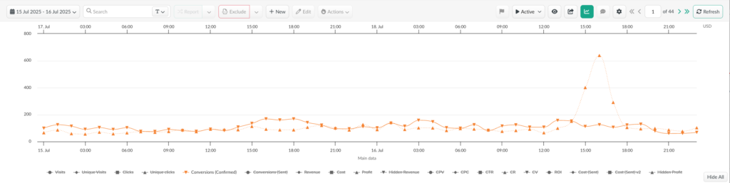
- To add or remove a metric, simply click on it.
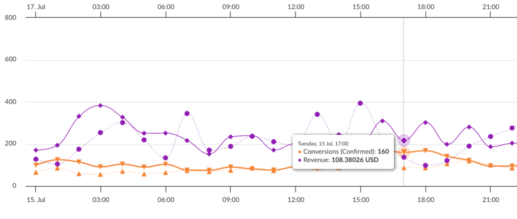
- For quick view mode, hover over an active metric: all other lines will be hidden, leaving only the two comparison lines for that metric with values for both periods.
- Data points on the chart provide a quick summary for the selected hour/day or interval, across a specific metric or group of metrics.
Benefit
Period comparison on charts is a convenient way to visualize campaign performance dynamics at a glance.
📩 We highly appreciate your feedback and feature requests.
Feel free to reach us via Live chat from the panel or website and at support@bemob.com